Here's a short manga I designed about a little's boy's daily playtime, meant to showcase a few different uses of katakana. As you can see, I've heavily utilized katakana for the sake of onomatopoeia, mimicking the sounds as the boy runs about, hits different toys and jumps. I also used katakana for emphasis on the word "strong", as the boy lifts his blocks, and on the word "I" in the boy's dialogue box to emphasize the feeling of toughness and masculinity. Lastly, I used katakana for Superman's name, as it is a foreign word/character name. (Just to be clear, this manga reads left to right, not right to left as usual in manga. Hopefully there was no confusion, sorry about that.)
Monday, November 19, 2012
Wednesday, October 31, 2012
Katakana Analysis (Final)
The words オレ and カワイイ, found written as such in a manga and on a magazine cover respectively, highlight two distinctive reasons for choosing to write in katakana rather than hiragana or kanji.
The オレexample was found in a speech bubble of a manga entitled 先生, in which the character speaking is referring to himself. It is written out in katakana rather than in kanji (俺) or hiragana (おれ), because the angular, "hard" lines of katakana serve to emphasize the masculine feeling conveyed by the word. おれ is a form of the word "I", used by men, and is both more formal and more masculine than ぼく, another form of "I" most commonly used by young boys . While katakana is thought to be more masculine, hiragana on the other hand, is thought to be a more feminine form of writing. In this particular manga, the male character speaking is younger than the girl he is interested in, so he tries to behave maturely to prove his manliness. Knowing this, it makes sense that katakana would be used here in his speech.
Having been found on the front page of CanCam, a fashion magazine, it is easy to imagine why katakana is used in the case of カワイイ. In this example, katakana is used to draw immediate attention the word. Because the subject of the magazine is fashion, the editors must have wanted to emphasize keywords pertaining to the styles highlighted inside, perhaps to give a preview to those browsing magazines about what to expect in the issue from just seeing the outside cover. Interestingly, surveying a large number of Japanese magazine covers reveals that カワイイ appears frequently on magazine covers in hiragana as well, not solely in katakana. In fact, a different month's issue of CanCam magazine features the word splayed across the cover in hiragana. It seems almost strange that a magazine targeted at young women would use katakana, when the magazine should be attempting to emphasize femininity. Maybe this plays into the choice of hiragana over katakana in that particular issue, in that it was chosen to exude femininity rather than catch the onlooker's eye.
The textbook definitions mentioned emphasis as a usage of katakana--this is seen in both examples--but they did not mention that katakana can be specifically used for emphasizing masculinity or femininity.
Tuesday, October 9, 2012
Katakana Analysis Draft
The words オレ and カワイイ, found written as such in a manga and on a magazine cover respectively, highlight two distinctive reasons for choosing to write in katakana rather than hiragana or kanji.
The オレexample was found in a speech bubble of a manga entitled 先生, in which the character speaking was referring to himself. It was written out in katakana rather than in kanji (俺) or hiragana (おれ), because the angular, "hard" lines of katakana serve to emphasize the masculine feeling conveyed by the word. おれ is a form of the word "I", used by men, and is both more formal and more masculine than ぼく, another form of "I" most commonly used by young boys . While katakana is thought to be more masculine, hiragana on the other hand, is thought to be a more feminine form of writing.
Having been found on the front page of CanCam, a fashion magazine, it is easy to imagine why katakana was used in the case of カワイイ. In this example, katakana was used to draw immediate attention the word. Because the subject of the magazine was fashion, the editors must have wanted to emphasize keywords pertaining to the styles highlighted inside, perhaps to give a preview to those browsing magazines about what to expect in the issue from just seeing the outside cover.
The textbook definitions mentioned emphasis as a usage of katakana--this is seen in both examples--but they did not mention that katakana can be specifically used for emphasizing masculinity or femininity.
Sunday, September 30, 2012
Katakana Samples
Sample 1: オレ, キレイ --> Emphasis

In this panel of manga, 俺 (おれ), a male form of "I", is written as オレ. This is most likely to emphasize the masculine feeling of the word. According to http://www.takase.com/Names/HowToWritePart1.htm, hiragana is associated more with femininity, while katakana is thought to be more masculine.
Interestingly, きれい is also written in katakana, as キレイ. This is most likely for emphasis also, though not for masculine vs. feminine reasons.
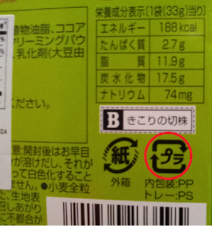
Sample 2: プラ, エネルギー, チョコスナック --> Foreign words, familiar symbols, abbreviation

Here we have two recycling symbols, one for paper (next to the circled プラ symbol), and one for plastics. プラ is the abbreviated word for plastic (プラスチック), a foreign word, hence the use of katakana.
エネルギー and チョコスナック are written as such for the same reason.
Sample 3: 女のコ, カワイイ--> Emphasis and ?
On the magazine cover, カワイイ is most likely written this way for emphasis.
What I find strange is that おんな is written in kanji (女), while こ is written in katakana (コ). I'm not sure why the two were written as such instead of both being written in kanji or hiragana.

In this panel of manga, 俺 (おれ), a male form of "I", is written as オレ. This is most likely to emphasize the masculine feeling of the word. According to http://www.takase.com/Names/HowToWritePart1.htm, hiragana is associated more with femininity, while katakana is thought to be more masculine.
Interestingly, きれい is also written in katakana, as キレイ. This is most likely for emphasis also, though not for masculine vs. feminine reasons.
Sample 2: プラ, エネルギー, チョコスナック --> Foreign words, familiar symbols, abbreviation

Here we have two recycling symbols, one for paper (next to the circled プラ symbol), and one for plastics. プラ is the abbreviated word for plastic (プラスチック), a foreign word, hence the use of katakana.
エネルギー and チョコスナック are written as such for the same reason.
Sample 3: 女のコ, カワイイ--> Emphasis and ?
On the magazine cover, カワイイ is most likely written this way for emphasis.
What I find strange is that おんな is written in kanji (女), while こ is written in katakana (コ). I'm not sure why the two were written as such instead of both being written in kanji or hiragana.
Tuesday, September 11, 2012
じこしょうかい
はじめまして。マリアです。ニュ-ヨ-クのウエストチェスターからきました。コロンビアだいがくのがくせいです。にねんせいです。にほんごのべんきょうがだいすきです。いっしょうにカタカナをべんきょうしましょう!よろしくおねがいします!
Subscribe to:
Posts (Atom)


